Over the last years, the work of the Schulte Group has broadened beyond the realm of traditional ship owning and ship management to specialised capabilities in various fields of the shipping business. The Schulte Group, with all its member companies, including Bernhard Schulte Shipmanagement (BSM), has become more integrated, evolved and grown its service portfolio as well as expanded its market presence.
“In previous years, we have established special business units for the cruise and offshore segment. We have also set up new offices in locations like Ghana and Mexico. With the expansion of our business areas, the number of logos and designs linked to the Schulte Group increased. But these visuals lacked a clean, common corporate identity,” remarks Ian Beveridge, Schulte Group CEO.
The refined visual identity adopts a more contemporary, digital-friendly and consistent presence in the market, reflecting the Schulte Group’s individual member companies’ combined service offerings and innovative spirit.
This rebranding is about much more than presenting a few new logos. It is about creating an identity that not only harmoniously aligns with the Schulte Group’s values, but also resonates with customers and employees, pushing the organisation’s business forward into the future.
The branding roadmap
Three specific objectives were identified for the new visual corporate identity:
- Present a clearer structure of the Schulte Group’s services and the business units delivering them
- Develop a more harmonious, strong family look
- Create more clarity, especially in the digital and media world
United under the Schulte ‘S’
After the goals were put in place, redesign work on the logos began.
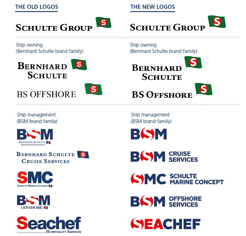
The Schulte ‘S’ was chosen as the core design element of all the new BSM, Schulte Group and Bernhard Schulte logos (all depicted on the right). Surrounded by a red circle, the ‘S’ represents the longstanding culture and heritage of the family-owned Schulte Group, combining ship owning (Bernhard Schulte) and ship management (Bernhard Schulte Shipmanagement) under one roof.
The enlarged and modernised ‘S’ has been brought into the brand families of Bernhard Schulte and BSM for more clarity, a strong recognisable family look and for better legibility, especially for digital use.
“In reworking the logos, we looked at what brings the different Schulte Group business units together visually, and in fact it is the Schulte ‘S’ that combines them,” explains Helga Reichert, the Schulte Group’s Marketing Executive Communications. Incorporating the ‘S’ into each of the new logos is not only expected to help strengthen the feeling of unity and harmony, but also makes it easier for our internal and external audiences to remember and identify the Schulte Group across the web.
In addition to the new logos, Bernhard Schulte Cruise Services has been renamed to BSM Cruise Services to strengthen the separation between the Group’s ship owning and ship management activities. Furthermore, BSM Offshore has become BSM Offshore Services to show greater alignment with the rest of the Group.
“In an increasingly competitive environment and with our expanded and diversified portfolio of services, we need to clearly identify and present ourselves in the market,” Ian notes. “With our new look, I believe we will improve brand clarity and consistency, which in turn will enable the Schulte Group to underline its position as a truly global integrated maritime services provider.”


